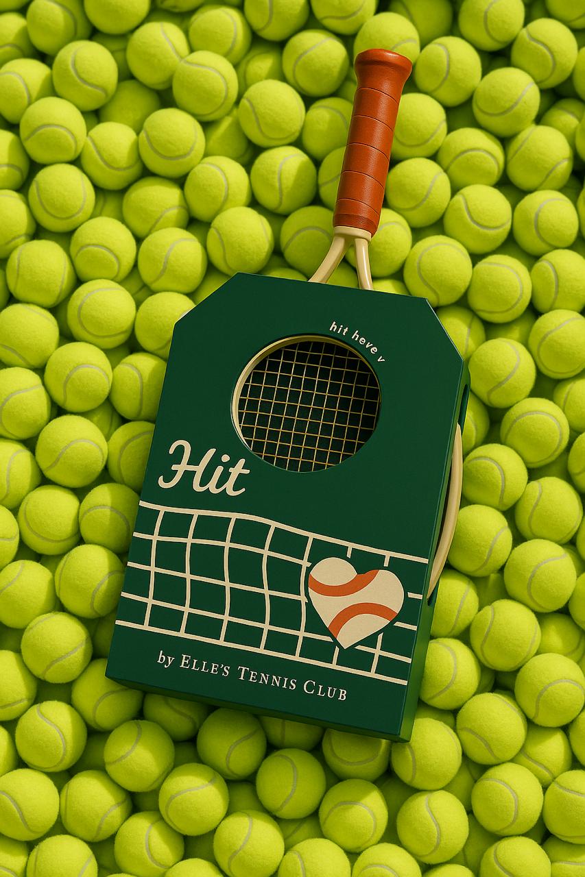
Hit
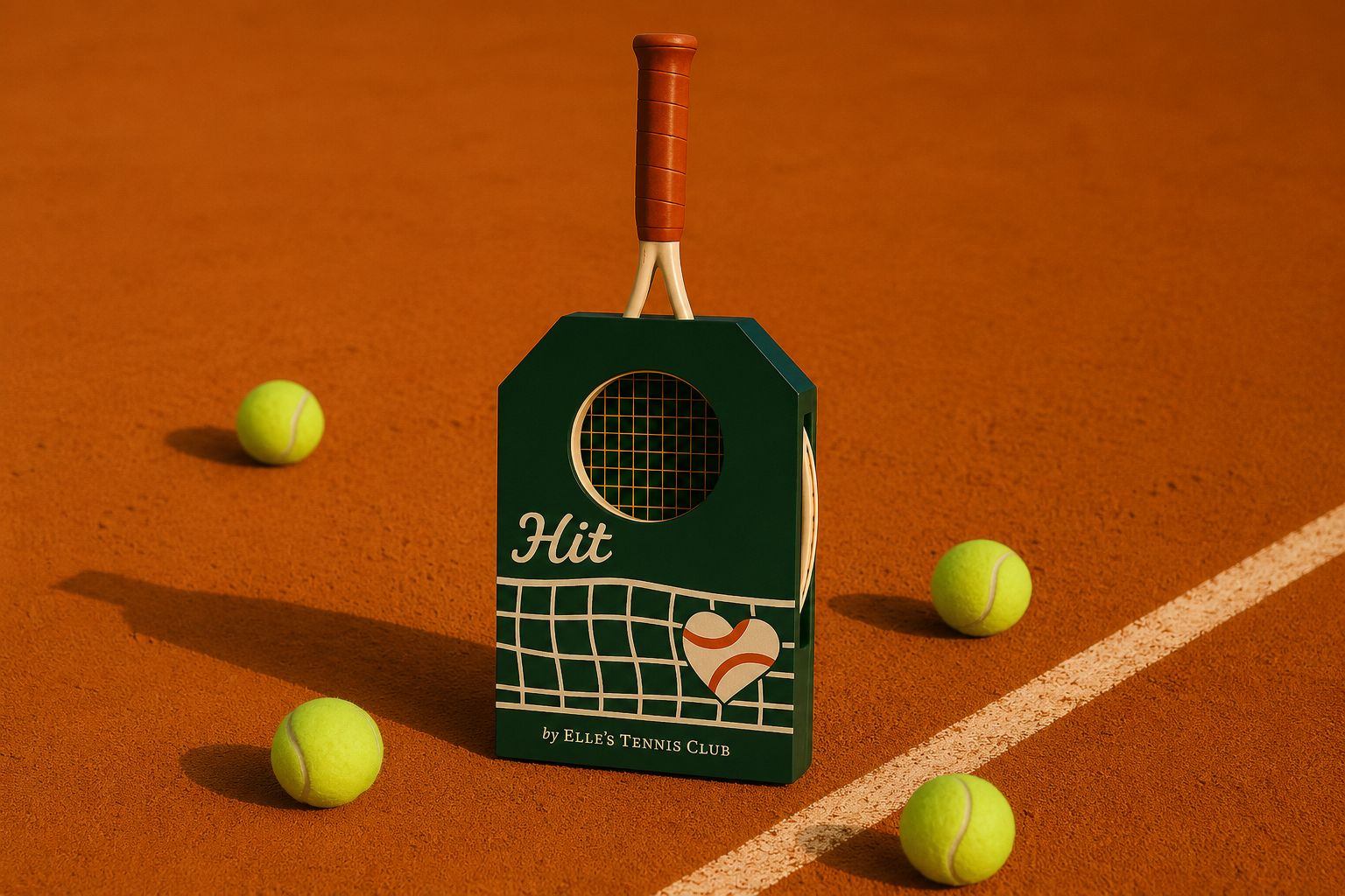
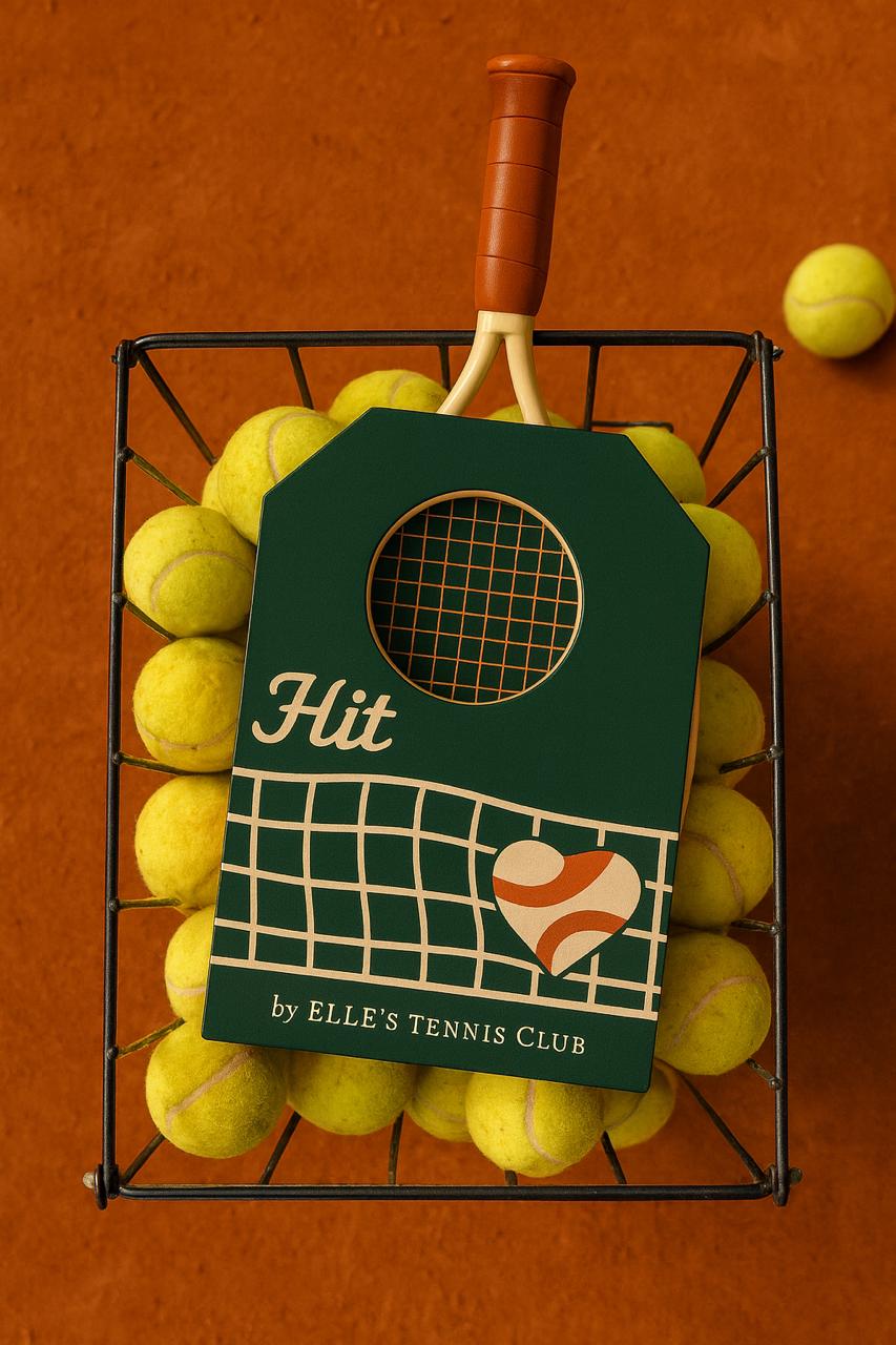
An interactive packaging concept that doubles as a hitting target. Once opened, you remove the racket, set the box upright and hit through the circular cutout. It encourages reuse rather than disposal, giving the box a second purpose beyond packaging. On the front, a heart-shaped card inspired by tennis scoring's first word "love" opens to reveal the concept and explain how the product works. It captures both the action and experience while expressing the club's values of creativity, connection and community.
- Type
- Packaging
- Year
- 2026
- Material
- Recycled cardboard
- Concept
- Reuse · Play · Community
The Problem
Packaging · Reuse · Brand
Most packaging gets opened once, and then thrown away.
The brief asked us to choose a reference packaging structure, study its grid and form, and adapt it for a product of our choice , balancing brand expression, precision and environmental consideration. HIT is the answer for an exclusive tennis club: an interactive package that doubles as a hitting target once opened, giving the box a second life and turning unboxing into play.
How might we design packaging that protects, expresses a club's identity, and earns a second life as part of the game?
Inspiration
Court · Net · Love
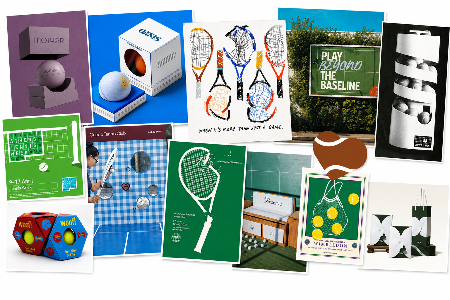
The moodboard pulled together tennis club identity , Wimbledon greens, clay court tones, hand-drawn rackets and the heart-shaped “love” of tennis scoring. Reference packaging structures showed how a tag, a window and a printed pattern could carry an entire brand story.
Ideation
Sketches · Form & interaction
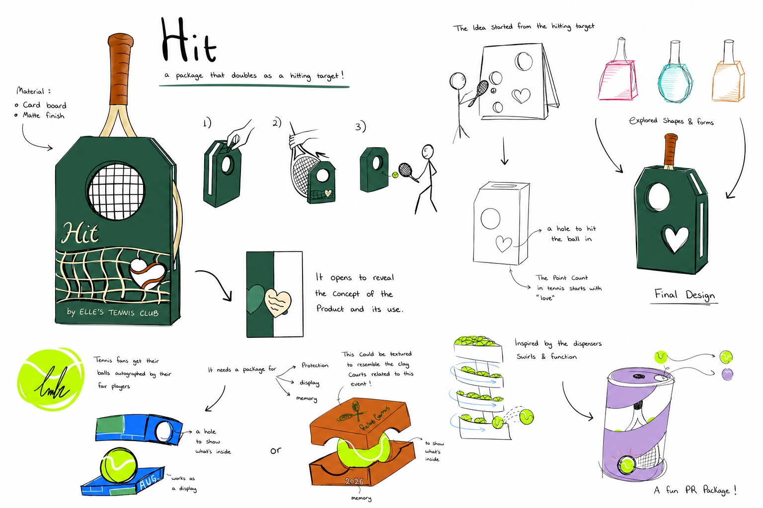
The idea started from the hitting target: a hole in the box to aim for. From there, sketches explored shapes and forms , a tag silhouette, ball-dispensing tubes, autograph displays , until the final racket-tag form emerged. The point count in tennis starts with “love”, so a heart-shaped card on the front opens to reveal the concept.
Development
Cardboard iterations → Final
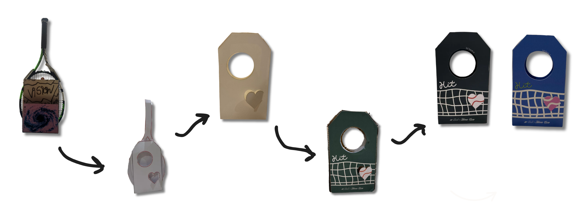
The prototype evolved from a rough cardboard mock-up wrapped around a real racket, into a clean white study model, then a refined kraft tag with the heart cutout, a first painted version, and finally the two colour-ways , black and Wimbledon blue , that test how the printed net, ball-heart and wordmark sit on the form.
Final Prototype
Thick paper · cardboard intent
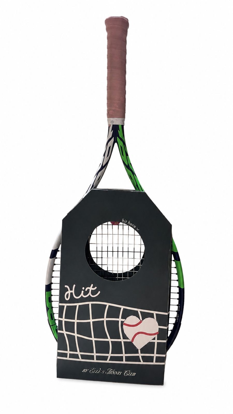
The resolved 1:1 prototype, built in thick paper and intended for medium-density cardboard, holding a real tennis racket to confirm fit, proportion and the printed graphic on the final form.
Dieline
AutoCAD · Reference → Adaptation
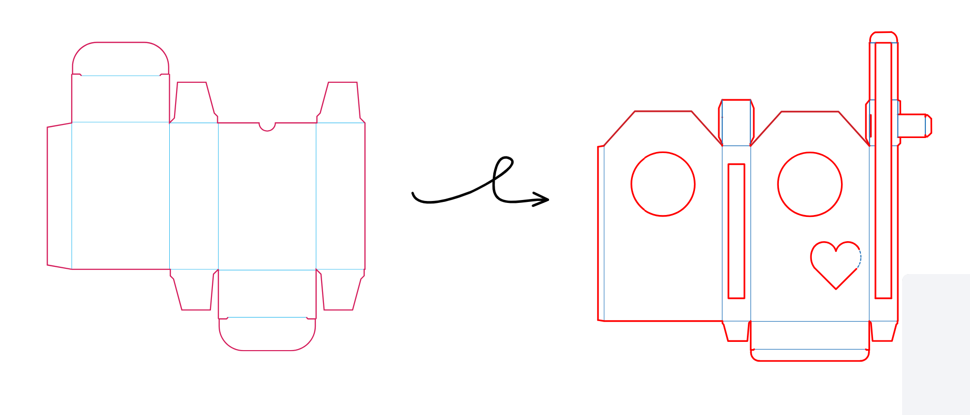
A reference packaging dieline was studied for its grid, fold lines and tab structure, then adapted in AutoCAD into the HIT tag form , with a circular hitting cutout, a side window for the racket and a heart-shaped opening for the “love” card.
Render
Clay court · Final scene
On the clay, between the balls.Packaging that earns its place on the court.